Univariate Predictive Analytics - Simulated data set
Fridtjof Petersen
quality_control.RmdWelcome to the first tutorial of the Univariate Predictive Analytics Module! The main functionality is to predict whether a process will go out-of-control in the future. The module is quite extensive but we can break down the process into 3 steps:
- Determining the control bounds
- Selecting and evaluating the candidate models
- Predicting the future with the best model
The basic idea is to first set the control limits, select various possible models and test their predictive accuracy on past data and finally use these results to select the final model that we want to use to predict the future. By using past performance as a proxy for future prediction performance we should be able to make a more informed choice of which model will perform the best.
We will demonstrate the functionality on a simulated data set that is supposed to represent a real world production process. Our dependent variable is the size of our produced good that is measured at the end of the production cycle. Since one production cycle for one piece takes approximately 100 data points from start to finish, our goal is to predict 100 data points into the future. That way we could intervene if the results of the next cycle were predicted to go out of control. Because if we would only notice at the end of the production cycle we would need to discard all the pieces from the previous cycle. We also have some measures from arbitrary sensors (could represent temperature, vibration or machine part age) measured at the start of the cycle that are somewhat related to the process. As we want to predict into the future we use the sensors measurement at the beginning of the cycle - in other words the sensor measurements for each piece are lagged by 100 data points.
The values of the process are primarily influenced by the heat of the machinery which depends on whether the machine is turned on over night or how long it is turned off for maintenance. It runs everyday from 09:00 until 17:00 and produces 60 pieces per minute. The current data set represents 7 days of data and we want to predict the end.
Determining the control bounds
Selecting necessary variables
As a first step we need to load the data into JASP which is shown in the following image:
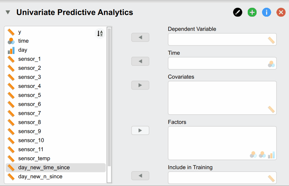
But what do of these different options mean? Our Dependent Variable y is the continuous production process we want to monitor and predict. The Time variable time contains the time stamps that must be supplied. Supplying Covariates and Factors is optional since they are not necessary for the classical time series models - but are needed for more complex models. In our case we include them as our sensor measurements are associated with our dependent variable and could thus improve predictive accuracy. Additionally, we have two variables called day_new_time_since and day_new_n_since that indicate how many pieces have been produced since and how much time has passed since the start of that day. They are useful because the time the machine has been on directly relates to its temperature - which affects the size of our produced pieces. Lastly, the Include in Training variable indicates whether a time point should be used for training and verifying the model (set to 1) or whether it should be used to predict the future (set to 1). While the observations of the dependent variable are of course not available for these data points as we want to predict them, it is needed to supply covariates and factors if we included them in our models.
Control plot and control limits
After the variables have been supplied, we automatically get a basic control plot in the result section of JASP:
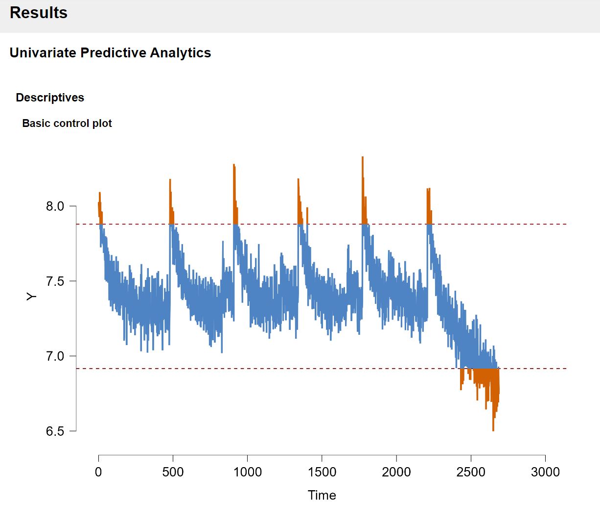
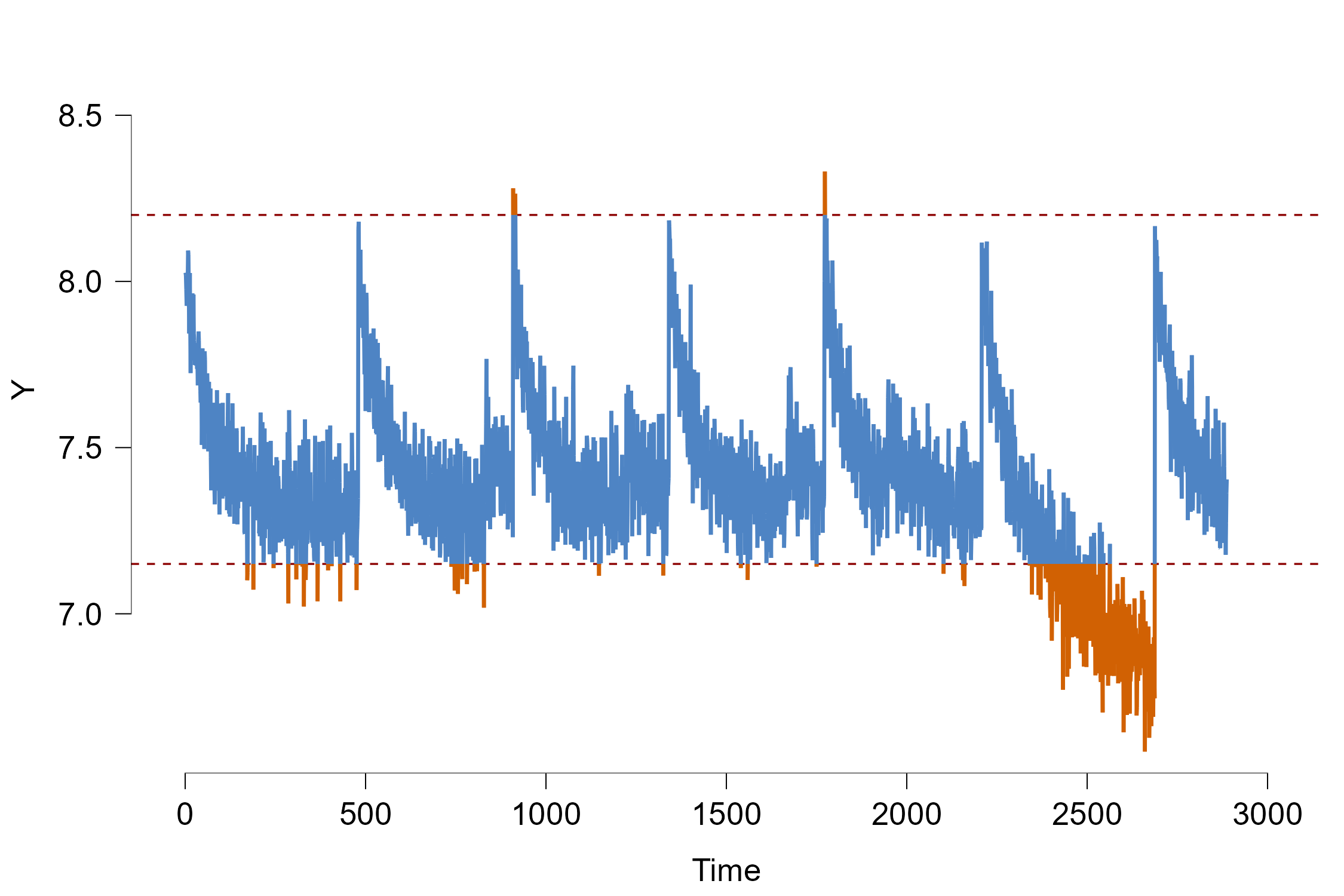
The red dashed lines indicate the control bounds that we don’t want to cross. As a default option, the control bounds are set in such a way that all the data that is more than 2 standard deviations away from the mean is flagged as out-of-control.
From mere visual inspection alone we can already see two things: There seems to be a cyclic pattern where the process abruptly jumps in size and slowly becomes slower again. As mentioned previously, this directly relates to the effect of the temperature: Since we measure the process over several days, the machine cools down at night when turned off which explains the sudden jump. A lower temperature causes the produced pieces to be larger. However when the machine is turned on continuously, the temperature slowly rises to a certain maximum temperature where the size of each piece is somewhat stable.
As a second observation the process seems to go out-of-control at the end of the time series quite rapidly. The hypothetical explanation is that a part inside the machine and broke and subsequently heats it up drastically which decreases the size of our products. Since it is undesirable to let the process exceed the control bounds, we will test in this tutorial whether the module can accurately predict whether and at which time point the process goes out-of-control in the past! This is called forecast verification as we test whether our model predictions can properly predict events in the past to make sure we can trust our models. Afterwards we will illustrate how we can use the JASP module to predict the unseen future.
But let us first adjust the control limits. In production processes we often know how large/small a produced object must be so be don’t have to set the control bounds based on data and standard deviations. For our example, we will increase the control limits somewhat as only the last part of the time series clearly goes out-of-control. We can do this under the Time Series Descriptives section:
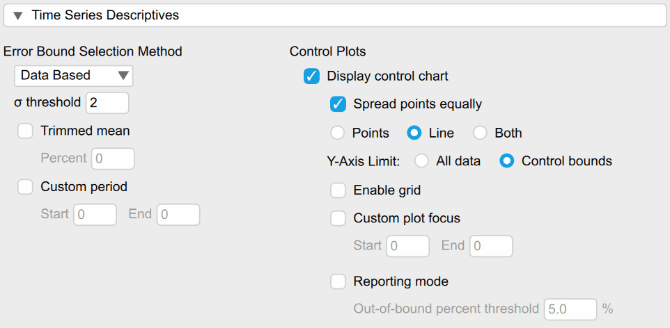
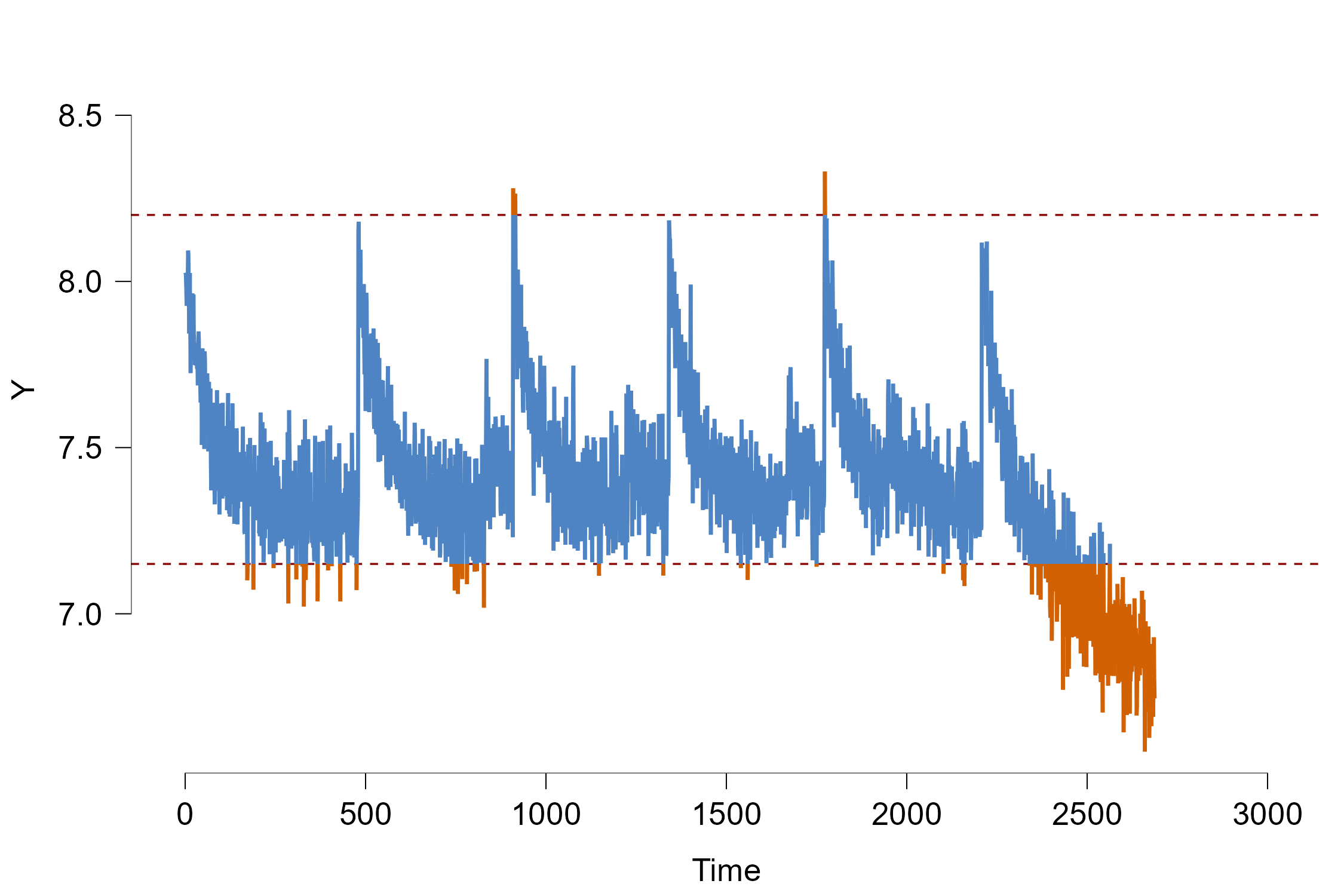
Under the Error Bound Selection option we can select Manual Bounds and then manually input the upper/lower limit of 8.2/7.15 which changes the plot into the following:
Selecting and evaluating the candidate models
Choosing Evaluation plan
As mentioned previously, we want to choose the model that predicts the future the best. One method for this is called cross validation where the existing data is randomly split into training and test data sets. The training set is used to train the statistical model which then make predictions about the test set that are compared to the real observation. By comparing the predictions with the true observations we can test how well each model predicts the unseen data and generalises.
As the goal is to evaluate the predictive performance on unseen future observation, normal cross validation that randomly selects training and test data is not appropriate. Instead, the data is split in such a way that the training data is always temporally before the test data. In our example we want to train the models on some amount of past data and then use the next 100 data points as test data as this constitutes one production cycle. Afterwards we shift the training window ahead by a certain amount of data points, we retrain our models and then predict the next 100 data points. This is called rolling window cross validation or historical forecast evaluation.
The settings for this procedure can be found under the “Forecast Evaluation” section in the JASP module:
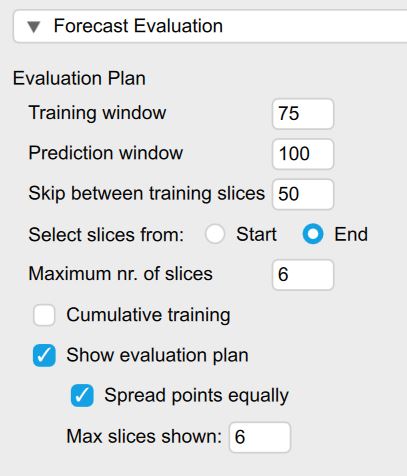
Figure 5: Creating an evaluation plan
The Training window option refers to how many past data points our model is trained on. Since we experience an underlying shift during the last day of the process and it goes out of control, we will only train the models on the past 75 data points. In practice it might be unknown on how much data each model should be trained on and different options should be considered. If the underlying data generating process stays constant over time, the models are ideally trained on all of the past - this can be achieved by checking the option for Cumulative Training. If the process changes (quickly) over time - as indicated by worse predictive performance a shorter training window might be a better choice.
The Prediction window option determines how many data points should be predicted into the future. This is ideally chosen in such a way that it corresponds to the prediction horizon one is interested in predicting (as different models might perform better in short and other in long-term forecasts). In our example, this corresponds to a prediction horizon of 100 as this represents one full cycle.
The next option called Skip between training slices indicates how many data points are shifted ahead for each prediction slice.
The Maximum nr. of slices option determines how many folds are created. Increasing this number leads to less prediction slices or folds that are computed but might increase computation time. Especially if computational time is scarce since we want to make a timely prediction about the future, we might want to select a smaller number. In our case we selected 6 as we want to only predict the last part of the process where the data goes out-of-control.
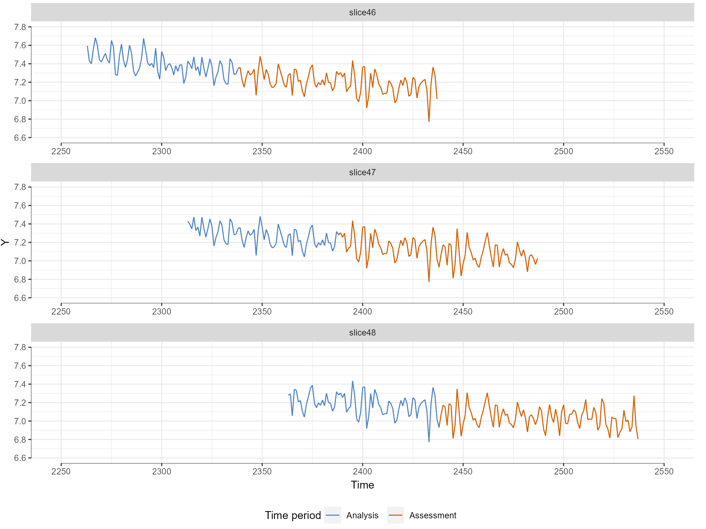
When we check the Show evaluation option we can also see the evaluation plan visualized to check which data the model will evaluate (see Figure 6). Here we see that the blue colored data is the training period that the models are trained on- whereas the red period will be predicted and compared with the actual observations.
Selecting candidate models
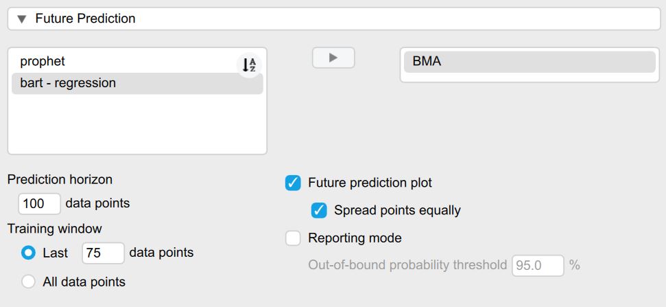
Now that we have a plan to evaluate the data, we can select the models that we want to use to predict the future. We can find the option for selecting different models under the Forecast Evaluation section under Model Choice. On the left side of the selection option, all available models are displayed while the right side indicates the models we have chosen for prediction.
A little explanation on the naming convention for all models: The model family is indicated as the first part of the model name before the hyphen “-” and the text afterwards indicates the model specification. For more a more in-depth explanation of all models and further resources on them see the Background section.
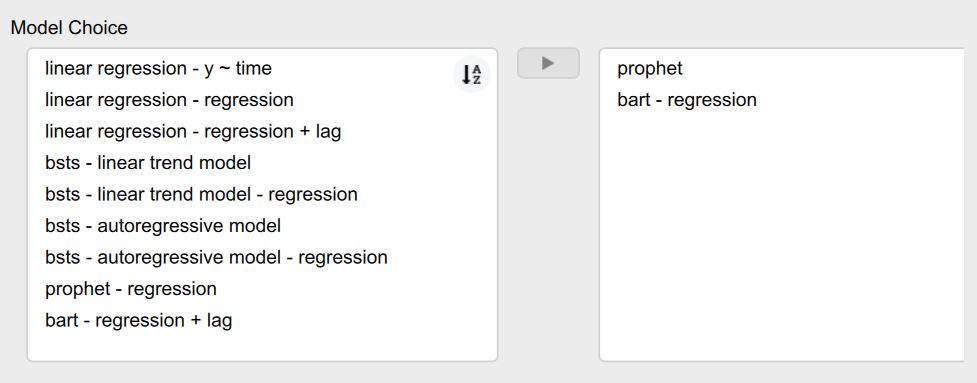
For example in our selected models, the prophet model is a Bayesian time series model that automatically models appropriate seasonality via fourier orders, trends and change points. As it is a time series model, it predicts future observation of our dependent variable based on its own past values. If we would want to add covariates, we would select the prohpet - regression model. Our second model denoted as bart - regression is a Bayesian Additive Regression Tree model. It combines multiple decision trees into a large ensemble model and is able to model high-dimensional non-linear relationships. As it is not a time series by default, we need to supply it at least some covariates which in our case are the sensors. Additionally, it is also possible to supply it with our lagged dependent variable. If we enable this option in the Feature Engineering section, internally a new column is created which contains our dependent variable but at a previous time point. That way even models that are not time series models can model the relationship of a variable with itself over time. When the model then predicts future data points in our test set, the predicted value for time point t is then iteratively used as a input covariate for the prediction of time point t+1. Note that this takes a long time for the BART model as the model is computationally complex.
After we have selected which models we would like to use for prediction, the models are being trained and evaluated based on the evaluation plan we specified earlier. After the computations are finished, we get a table with the corresponding evaluation metrics and are also able to plot our predictions.
Choosing an appropriate evaluation metrics
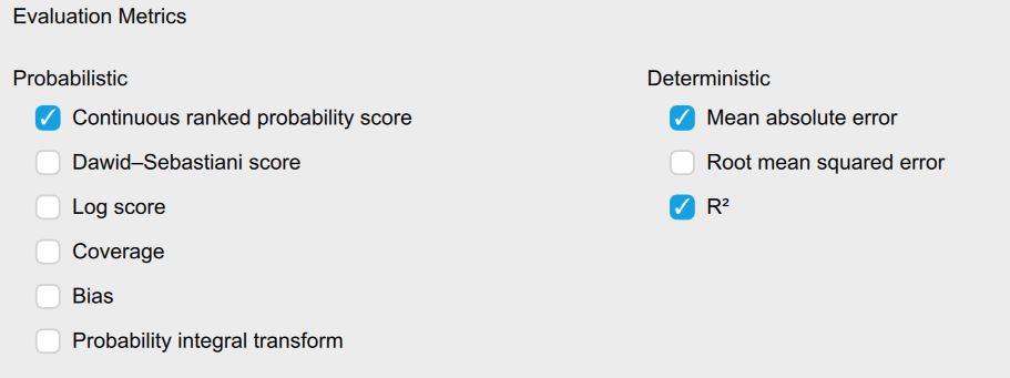
One can evaluate the prediction accuracy of our models by computing so called evaluation or forecast metrics that measure how well our models predict the future by comparing the actual observations of the test set with the predictions. The JASP module offers both probabilistic and point-based prediction metrics: Instead of relying on the point or mean prediction of a model, probabilistic forecast metrics compute how much the observed value differs from the whole predictive distribution. That way we are able to take into account the uncertainty that is associated with our predictive distribution. Ideally, our distribution is very sharp as this indicates that we are very certain in our prediction.
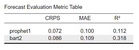
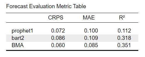
For the current example we focus on the mean absolute error (MAE), the Continuous Ranked Probability Score (CRPS) and the R-squared value. As the name suggests the MAE is calculated by calculating how each observations differs from the forecast in absolute terms (i.e. removing the minus of negative numbers) and averaging it across all predicted observations. The CRPS on the other hand generalizes the MAE as it computes it for the whole predictive distribution instead of only a single forecast value for each observation. The R-squared value tells us how much variance is explained by the forecast. The other forecast metrics are explained in detail here. In general, all forecast evaluation metrics can be selected under the section Forecast Evaluation -> Evaluation Metrics:
Forecast Evaluation Metric Table
Now let’s look at the table with forecast evaluation metrics. The first row indicates the corresponding model name. The other rows indicate the values of the corresponding evaluation metric. The values are averaged across all evaluation slices set previously. Lower MAE and CRPS values indicate that our prediction performs better while higher values of \(R^2\) indicate a better prediction. While MAE and CRPS are dependent on the scale of our data (i.e. if I were to multiply all observations by 10, the MAE values would also increase by 10), the \(R^2\) values are scale independent where a value of \(R^2 = 1\) would indicate that the observations are predicted perfectly by our model and a value of \(R^2 =0\) that our predictions fail completely. By comparing the values for each model we can determine which of our candidate models predicts the best.
From comparing the prophet and BART model with each other, we can see that the prediction of the prophet model generally predict better as both the CRPS and MAE values are lower. On the other hand the \(R^2\) value for the BART model is much higher which can be explained by the fact that the model is more flexible. Thus it explains more variance of the observed data, while this extra flexibility makes the predictions more wrong on average - as measured by the MAE and CRPS. This will become more obvious if we observe the plots of the data.
Forecast Plots
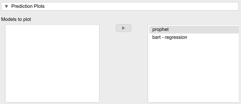
We can also visualize the predictions of each model against the real observations. We can select the models we want to view under the section Prediction Plots.
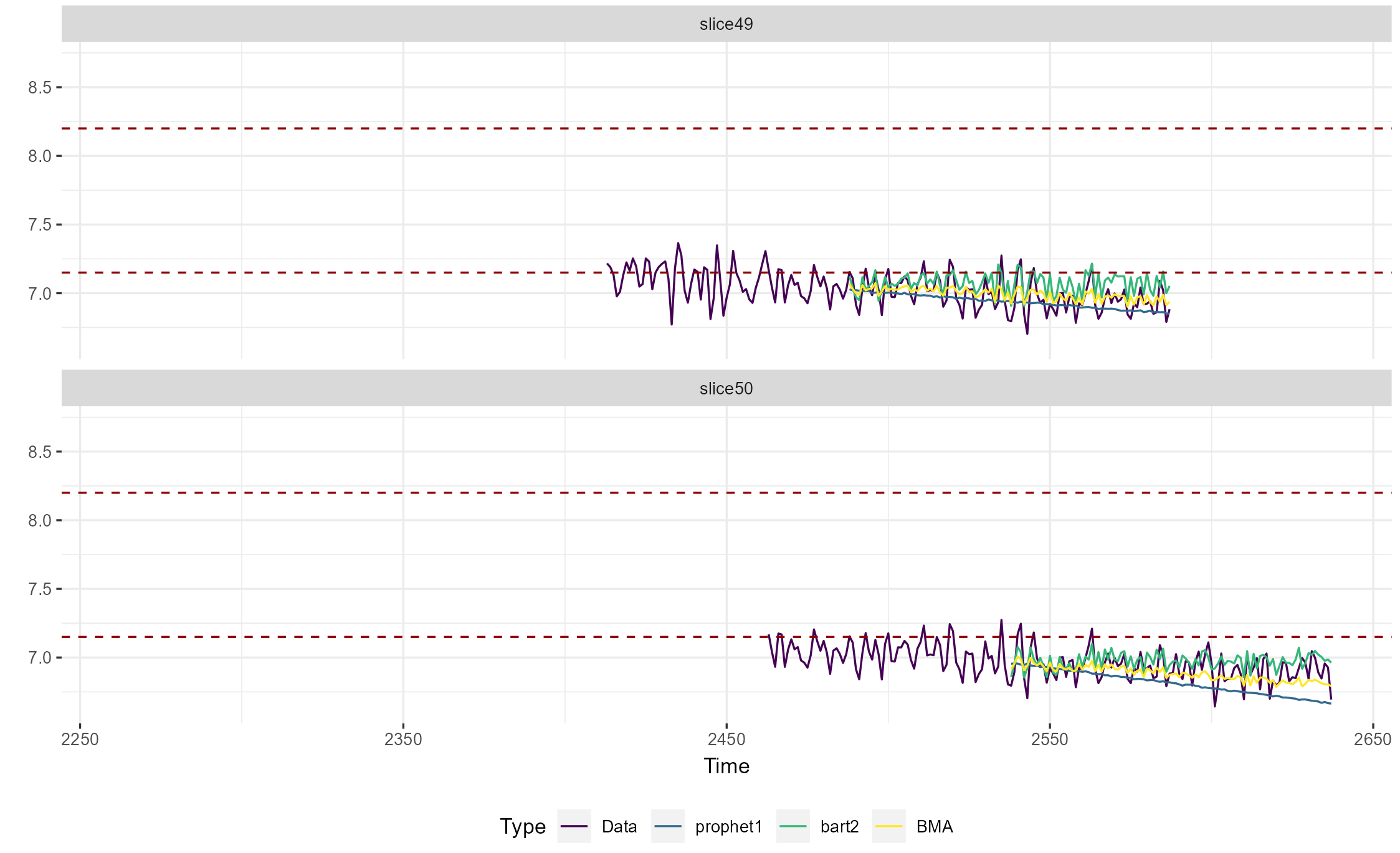
Afterwards the corresponding prediction plot is shown in the JASP output. As shown in the legend at the bottom, the different line colors represent the different model types. The real observed data is shown in purple, the prophet model in green and the BART model in yellow. The real data depicts both the training window used to trail all models as well as the prediction horizon that was used to calculate the evaluation metrics. The two dashed red lines depict the control limits so we can verify whether the models accurately predict that the data goes out of control. Each evaluation slice is shown as a separate plot.
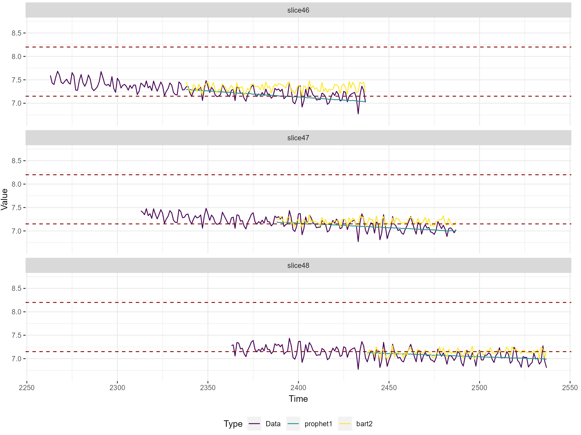
In general, we can see that the data is predicted quite well by both models. The process only seems to go really out of control in the last two slices/around data point 2500 which is more visible in the overall control plot in Figure 4 at the beginning of the tutorial. The prophet model seems to be better at predicting the overall trend of the data, while the BART model predicts the fluctuation of the data better and does not pick up as well on the downward trend. This makes sense as the prophet model is designed to predict the trend and seasonality of the time series data, while the BART model is better at predicting relationships with the covariates and does not explicitly model the relationship of the process with itself. This also aligns with the results from the evaluation metric table that was shown in the previous step: The prophet model also had the lower error as measured by the MAE and CRPS while the BART model explained more variance of the real observations. In general we can conclude that we do a decent job at predicting that the process goes out of control.
Selecting the best model for future prediction
After we have evaluated the predictive performance of our models on on past data, we are ready to select the model from our candidate pool that we want to use to predict the future. From the metric table and prediction plot, we have observed that the prophet model does a better job at predicting the overall trend of the process, while the BART model is better at predicting the variance in the data. In an ideal world, we would have a single model that is good at both trend forecasting and complex covariate relationships. When this is not feasible from a computational or statistical standpoint however, we can instead combine the predictions from different models. This way one doesn’t have to choose manually between different models - which might benefit applied user of this module - and one can potentially improve predictive accuracy compared to choosing any single model. One method to combine different model prediction - and which is implemented in this module - is called forecasts ensemble Bayesian model averaging. It is discussed briefly here and in more extensively here.
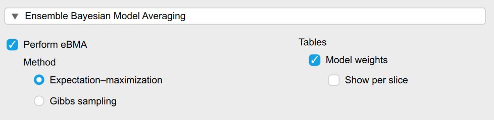
Ensemble Bayesian Model Averaging
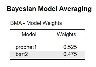
In general, ensemble Bayesian model averaging (eBMA) consists of two steps: First, model weights are assigned to all models based on their past predictive performance. The weights are also called posterior model probabilities as it can be interpreted as the relative likelihood that the true observations originated from the corresponding evaluated model - compared to all other considered models. Secondly, these weights are then used to weight the individual model predictions for future data and finally sum them to combine them into a single ensemble model. In the present JASP model, the weights are estimated separately for each evaluation slice, and then used to adjust the predictions for the next slice. Then we compute the evaluation metrics for the eBMA predictions so we can determine the predictive benefit compared to any single model. Finally, we use the model weights from the last evaluation slice to adjust the out-of-sample predictions for the future.
In order to use ensemble Bayesian model averaging (eBMA) in JASP, we simply need to check the checkbox Perform eBMA in the section Ensemble Bayesian Model Averaging. Prerequisite for this is that we have performed forecasting evaluation with at least two models previously. The Method option determines how the model weights are determined and are by default set to the faster Expectation-maximization algorithm. The Evaluation Method determines how the predictive benefit of eBMA is evaluated. Additionally, we can also show the model weights averaged across all evaluation slices - or per individual slice if we want to know specifically what weights were used to adjust the prediction
As a result we obtain a table with the model weights and an adjusted evaluation metric table that includes the eBMA model. Across all slices the prophet model receives a slightly higher model weight which indicates that it is more likely to be the best model. This is in line with the evaluation table where the prophet model outperformed the BART model only slightly as well in terms of MAE and CRPS.
When looking at the evaluation metrics we can see that the eBMA predictions decreases the CRPS values by ~17 percent and the the MAE values ~15 percent compared to the prophet model. When looking at the \(R^2\) values, the eBMA approach increased the metric by 12.5 percent. So based on these metrics we can argue that combining the predictions of different model via eBMA has indeed improved prediction accuracy substantially.
But how do 15- 20 percent actually look like? In our example data set we hypothetically want to predict whether a process goes out of control. Is the increase in prediction enough to make better decisions of whether we should turn the machine off or intervene in a different way ahead of time? For this we can look at the prediction plots we discussed earlier. We can now also visualize the eBMA predictions. As an example we will only investigate two prediction slices. In both cases the predictions of the prophet model (blue) are a bit too low and the predictions of the BART model are a bit too high (green). The eBMA predictions however are better overall and somewhat closer to the real observations displayed in purple.
Predicting the Future
So far we have set the control limits, evaluated all models and explored whether the eBMA approach can help us in making better predictions. Now it is finally time to predict the actual future. Let us pretend that a new day has started and tested whether the module could in principle predict whether the process goes out-of-control. At the same time we fixed our production machine and replaced some parts to hopefully stop the machine from going out of control again. Let us also pretend the database connected to our module has been updated and new data has already arrived. The process has not gone out of control and the corresponding control plot looks like this:
To predict the future, we need to open the section titled Future Prediction. The first option lets us select the model that we want to use to predict the future. Here we simply use the ensemble Bayesian Model Averaging as it weights all selected models automatically for us - and as previously shown can provide a predictive benefit over a single model. The model weights are taken from the most recent training to adjust the future predictions.
The values for the prediction horizon (how far we want to predict into the future) - as well as the training window (how much of past data we want to use for training) are by default set to the same values that we selected for the model evaluation. Alternatively, we could also set custom values or train the models on all of the past models. The Future prediction plot checkbox is automatically enabled as soon as a model is chosen for prediction.
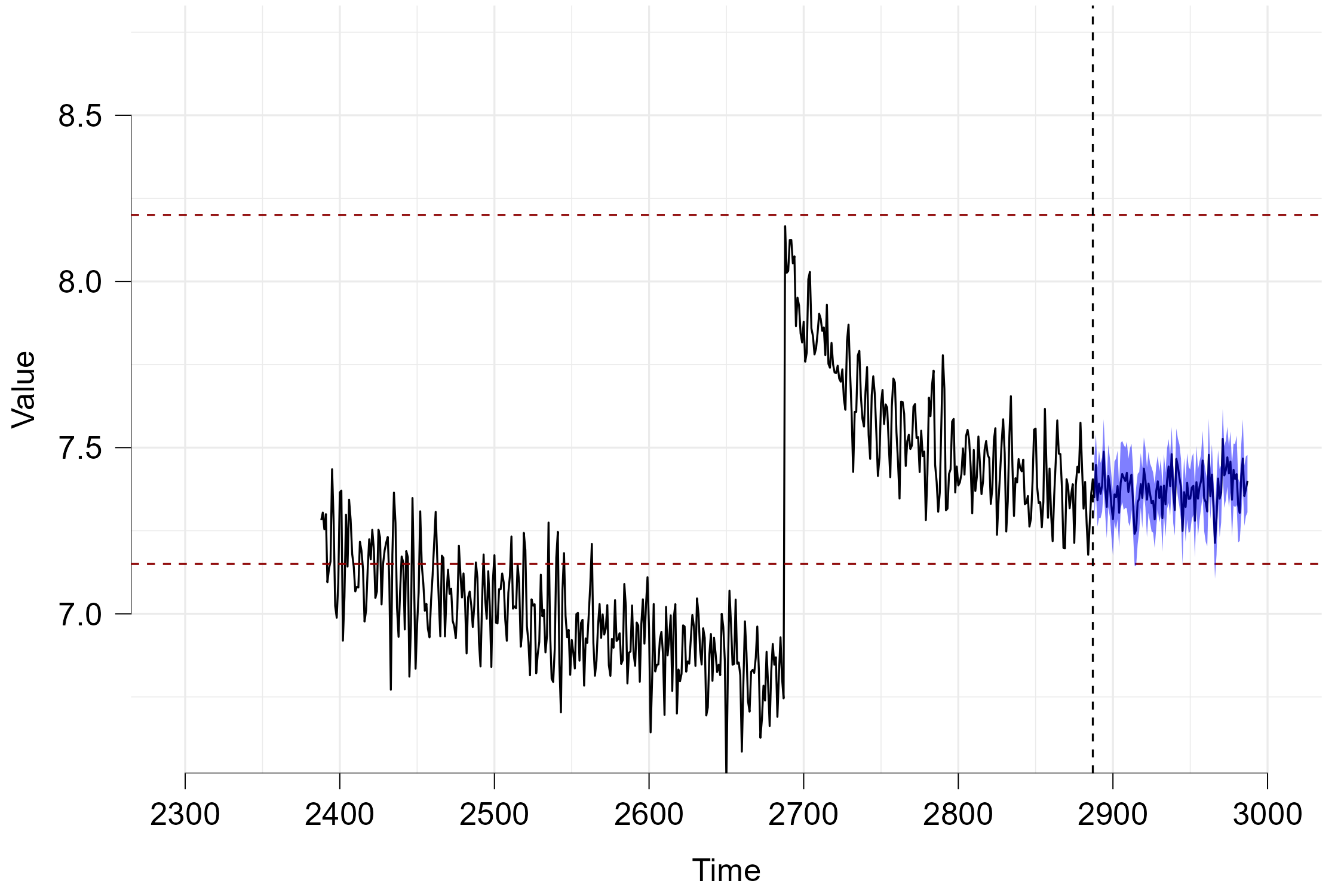
Now lastly we can look at the prediction plot that appears as soon as the computations have finished. The horizontal red dashed lines again represent the control bounds. The data depicted in black before the vertical dashed line represent the real data while the data afterwards depicts the predicted future. The blue area depicts the 95 percent credible interval and can be interpreted in the following way: Given all past data and the predictions of the different models, the eBMA method predicts that the unknown future observations will fall within this interval with a probability of 95 percent. As neither the black line (mean prediction) nor the credible interval fall outside of the control limits, we can assume that the process will not go out-of-control within the next 100 data points.
Summary
In this tutorial, we provided an overview of how to use the new Univariate Predictive Analytics module with a simulated data set. We showed that we can evaluate the predictive performance of a variety of statistical models (ranging from linear regression, classical time series models and machine learning algorithms) via both point-based and probabilistic prediction metrics. We also showed how we can use ensemble Bayesian Model Averaging to combine the predictions of different models to obtain better predictions compared to any single model. Finally, we showed how we can use these model predictions to predict whether a process will go out of control.
Additional Features
The present tutorial did not cover all functionality of the module as this would have been to extensive. In the future, we will add more tutorials to explain the rest of the features. A few notable examples are:
Time Series Diagnostics: The module also offers several diagnostic tools such as Autocorrelation Function Plots - which enable us to determine how related our dependent variable is with itself and thus how suitable it is for time series models. One can also create outlier tables if one is concerned with determining which specific observation went out-of-control.
Feature Engineering: Some of the models such as BART cannot model autoregressive or seasonal components by default. Thus, we added the ability to manually created lagged versions of the dependent variable to enable iterative predictions and add automatic time-variable features that can allow these models to accurately model seasonality.